There’s chatter today among some of my digital humanities folks about creating swizzly digital CVs: see for example one of the gurus of Digital Campus, Found History‘s Tom Scheinfeldt’s post from last May, “New Wine in Old Skins: Why the CV Needs Hacking,” followed by Adam Crymble’s borderline-smug post today, “My CV is Better Than Yours.” I suppose this website is something like a CV, if you bother to click between the “Writing” and “Projects” pages, but I’ve no desire to emulate Crymble’s faux-newsletter design – it would (alas) probably be considered simply gimmicky in my neck of the woods.
A syllabus, now: that’s another matter.
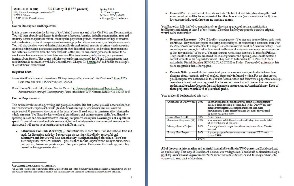
For a while I have been dreaming of taking the syllabus for the course I offer every semester (US History II) and doing… something with it. I just wasn’t sure what that something was. I only knew that this was not sufficient –
Talk about graphically challenged!
I’ve been tweaking the content of the syllabus for a couple of years now, but was looking for a way to arrange or present it that was less linear, less text-y, more visually engaging, more like a magazine or a website.
More substantively, I decided to re-think the purposes of my survey course and how I articulated those purposes to my students. I have realized that my classroom invariably contains multiple audiences – those with an antipathy to history, a severe learning disability, functional illiteracy, or an allergy to opening the textbook who are just hoping to escape my clutches with a barely-passing grade; a few coveted slots for Honors students who are usually strong discussants but are rarely history majors; some passionate budding young historians or future schoolteachers; recent immigrants for whom American history is a vast cipher; sometimes even a retiree on the free-tuition program whose life experience overlaps the course content… and usually the majority of young people eager to learn and engage with course ideas but so overworked from second jobs and demands of the commuter-student life that they are more likely than not to fall asleep in class and would prefer to be “fed” information rather than be made to work for their knowledge.
This past semester I conducted a week-long experiment during our unit on the Civil Rights Movement. In the past I have directed the narrative with a heavy hand, using a combination of lecture, discussion of news images on PowerPoint or snippets of notable primary sources, perhaps a short film clip or two. You know, the usual, but inevitably a highly selective version and always leaving me frustrated at what was omitted. I felt that this approach was disorienting/incoherent to beginning students, needlessly reductive to the more advanced ones: too much for some, not enough for others. They arrive in my class with a wide range of experience in studying or caring about the civil rights movement and it’s so broad, embracing law, education, violence, organizations, culture, religion, politics, across many states/fronts/events – what to do?
This time around I asked students to self-assess their knowledge level about the movement, and to set a specific learning goal for the week and decide on some kind of end result that would achieve that goal. Then I moved them into three groups by their responses: 1) students who were hoping to GAIN basic knowledge about the movement and its chronology and major figures, 2) students who had the basics but wanted to EXPAND their knowledge in some way where they perceived gaps in their own understanding, and 3) students who felt they were ready to APPLY their knowledge. Some students worked individually, others in pairs or small groups. I brought book resources to each of the 3 class sessions and they had access to their laptops. The products by the end of the week included flash cards, timelines, handouts, notes, outlines – a pretty wide range of learning tools that students had chosen and created themselves. Although everyone’s pace and results were different, we all agreed that sacrificing coherence in favor of advancing personally relevant knowledge was a reasonable tradeoff and had been a success. You can’t run an entire semester that way, but a week – that worked rather nicely.
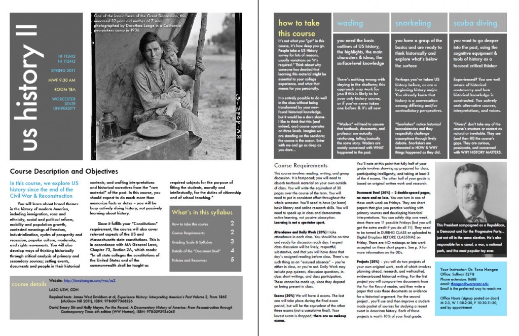
It did get me thinking that the categories into which I had invited my students to sort themselves also applied to the course as a whole, and I realized I am actually quite happy for students to be on any of those three “tracks” as long as they are making measurable progress on that track (or, even better, jumping track to the neighboring one at some point). I found myself writing a kind of manifesto for my course, initially envisioning my three categories as “mild, medium, and spicy” (like salsa). Later I decided a more apt metaphor is the encounter with an ocean, in which some will wade, others will snorkel, and some will scuba dive. And although I’m writing as if these are stepwise “levels,” of course it’s more of a continuum.
“Mild” (Waders) means that students tend to assume (for the sake of clarity if they are beginners to history or the content of the course is all new for them) that what I say reinforces what the textbook says which reinforces what the reader’s primary sources tell us about the past. Further, they will be likely to assume that the structure or specific content of the course is “natural” rather than artificially constructed/selected/crafted. They are mainly just trying to wrap their heads about what happened in the American past.
“Medium” (Snorkelers) students are beginning to understand that history is a conversation and that they can enter that conversation; they may notice inconsistencies between their readings and what I say in lecture, and may be confident enough to raise those in (respectful) discussion. They are aware of the constructed nature of historical knowledge and perceptive of the areas where their own knowledge is strong or weak. They know that what they’re being offered on the syllabus is not all there is to know. Snorkelers are interested in questions of contingency in history, and in how and why things happened as they did.
“Spicy” (Divers) go beyond the surface, seek out alternative sources, recognize and challenge their own assumptions, eagerly seize the intellectual challenge that a wide-ranging historical survey can be. They are hungry and curious and they reject the assumption that the course’s content or structure is in any way natural. They encounter genuine moral consternation about what happened in the past and try to work through that using intellectual tools (reason, evidence, argument, theory). They care about what happened and draw connections that make the past relevant to their own experience and circumstances. They inscribe themselves somewhere on the wheel of history. They alternate between wonder and rage. They critique–and make–lasting historical knowledge.
After writing this, I began to think that I had nothing to lose by telling students to get on one of these tracks, according to their experience and comfort level, by way of helping them be more intentional about their learning. From there, I decided to reinvent the syllabus itself.
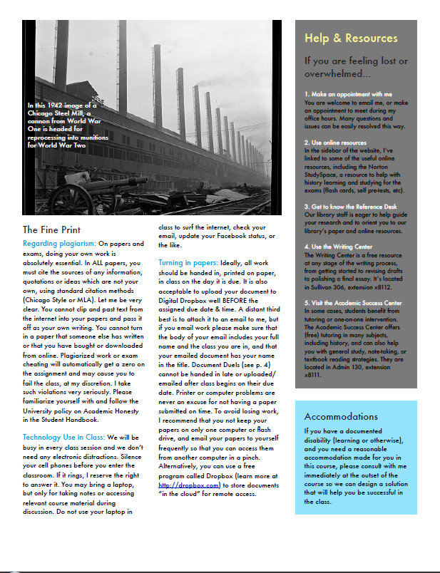
Of course there are things that every good syllabus must contain (see list below). And although I publish it as a PDF and make it available online, the paper version is still necessary and expected at my institution. SO in some ways it can’t depart TOO much from convention. But applying some layout tools to it – sidebars, boxes, images, varying the font, titles, a table of contents – makes the end product far more engaging, no?
This isn’t the whole thing – I’ll put a link here when it’s done and uploaded for my students, but these screenshots give you the general idea. I used one of the polished newsletter templates in Pages for Mac, since we recently got one at home.
 I can’t decide if I should just bite the bullet and print it in color (I’m only teaching one section this term, of about 32 students), or if printing it in black-and-white will be fine, since they will have the pretty PDF electronically.
One section I expanded considerably this time around was the “Help and Resources” (right sidebar on the last page), for students who begin to struggle in the course, and including online, course, and campus resources for history learning, writing, tutoring, and academic success. I have learned not to assume that students either know about or utilize such resources; hopefully this will highlight them a little better.
Elements of a Good Syllabus –
- Course information, including year, catalog number, section number, Gen Ed or departmental requirements it fulfills
- Instructor information, including phone, email, office location, office hours, website
- Course Description and Objectives
- Student Learning Outcomes, whether phrased explicitly or woven into the description/objectives
- Required textbooks, with ISBNs
- Strategies or advice for course success
- Course Requirements, including clear grading scale & due dates
- Assignments, in at least nominal detail
- Detailed syllabus of course meetings, topics, readings, and what’s due on each date
- Guidelines for submission of assignments
- Other course policies, like attendance, use of technology in class, academic honesty
- Resources for help, legal statement about disability accommodations


Good heavens — this is a phenomenal shift! Outstanding work, making me jealous. (And thanks to @robotnik for the RT, too.)
Pingback: Tweets that mention Extreme Makeover, Syllabus Edition « Tona Hangen -- Topsy.com
Pingback: ProfHacker - The Chronicle of Higher Education
I’ve featured this on my conference poster blog as an example of how using a design approach changes things so much: http://betterposters.blogspot.com/2011/08/stunning-sleek-cool-syllabus.html
I do wish you had talked about the revamping of the look of the document in the sort of detail you describe changing the information within it.
What program did you use for developing this new syllabus?
Hi Noah, I used a template (Design Newsletter) that came installed in Pages for Mac and then tweaked its color scheme to my liking. The photos are public domain images from the Library of Congress.
Amazing. I recently went back to grad school after teaching, and I have to admit that both my own teaching and my experience as a student could have benefited from this design approach.
This is fantastic! I was working on something similar for an outreach project but now I’m inspired to do it for my university teaching.
Could I use your wader, snorkeler, scuba diver categories to describe the levels of science learning? I am happy to list you as the source/inspiration.
Tona, how do you deal with accessibility requirements (ADA) for your syllabus? I would love to do something like this, but our campus requires a standard syllabus format in order to make them readable for those with disabilities. I’m happy to accommodate my students with disabilities, but I also see it is a great pedagogical loss that I can’t be more thoughtful and creative with my syllabi. (I’m a sociologist who teaches in an American Studies program, so there’s a lot of overlap in your post with what I do.)
genegeek: yes, absolutely! Thanks!
Todd: good question. I suppose one would have to compromise and make 2 versions, one ADA-compliant using your campus’s required format, and a second one with a more idiosyncratic or creative design. I made a behind-the-scenes document with all the text before I could plug it into the newsletter format (it mostly resembled my old text-heavy syllabus), so it probably wouldn’t be too much of a stretch to collate all the syllabus’s content, then take the same info and plug it into two different kinds of documents. You’re right, though – something’s likely to be lost in not being able to personalize a syllabus to this extent.
Tona, what a great idea, and I love that you tailor the syllabus for different types of students. Reading the caption from the picture on the first page, I thought you might find this interesting (http://articles.cnn.com/2008-12-02/living/dustbowl.photo_1_migrant-mother-florence-owens-thompson-picture?_s=PM:LIVING).
I love this idea… Just last week as I was copying syllabi and looking at the 8 pages of text heavy content i was trying to think of how to make it more visually appealing… This is brilliant! If you don’t mind I think I will take the newsletter approach myself for at least one of my classes next semester to test things out
Pingback: Too much time on their hands… « Quantum Progress
Boy I wish I could do that. What an awesome and functional redesign. But my college also requires a standardized syllabus – they even send us a template every semester that we must follow. I can’t even begin to tell you how much of a fight I had to wage to be allowed to put a picture of myself and the textbook cover on the syllabus.
For students with limited reading ability, this syllabus is way too complicated (and too long). I find that pages with lots of boxes and sidebars are harder to read and off putting (rather than engaging) to many of my community college students.
Trackbacks to this post:
ProfHacker “Creative Approaches to the Syllabus,” 8/26/11
Quantum Progress, “Too Much Time on Their Hands,” 8/29/11
Lone Star Librarian, “Weekly Link Roundup,” 9/2/11
(Sorry to put them in by hand… for some reason I can’t get them to publish automatically)
Pingback: Weekly Link Roundup | Lone Star Librarian
This is great! And I feel stupid for asking but I didn’t read what “Sprint” means in your syllabus. If it’s there, I missed it–probably because I’m grading final essays and exams. Again, this terrific.
Hi CCT, sorry, your comment got lost for a while in my spam filter. “Sprint” meant a dash through the material. I was trying to vary the pace of the course, literally rushing through some things so that we could take our time with others. In retrospect I doubt if they could tell the difference as much as I’d hoped. This semester I tried something completely different, and had them vote from a list of topics which ones they’d prefer to drill down a little deeper, and I’m leaving even more out rather than trying to cram it all in. Coming to terms with what I can and cannot fit into a class is an ongoing process for me!
Pingback: Creative syllabi? | engl760860