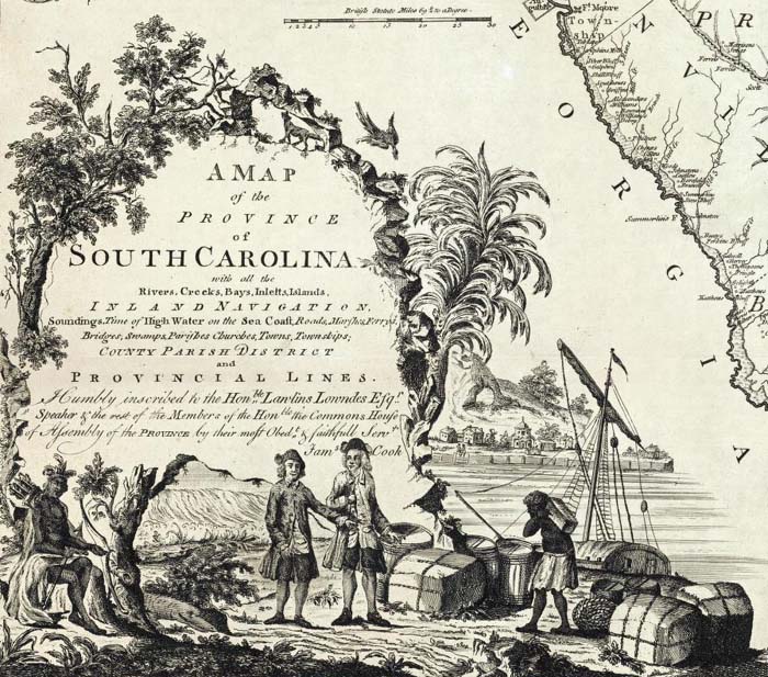
For the last Historian’s Craft “sandbox” week we looked at visual images, particularly maps. This is because the HistoryMatters survey course has a terrific essay by David T. Stephens, “Making Sense of Maps,” with some online exercises (although a few had broken links, alas). The analytical work of “visual images” week could also have been well served with a different source base instead, such as photographs, political cartoons, etchings, flags, architectural drawings. We just happened to use maps, partly because it can broaden out into the concept or act (the method) of mapping itself.
The week was split up into two sessions, as the others have been: a “lecture/discussion/think” day and then a “workshop/do something” day.
For the first session (class blog post here), I used Stephens’s categories and outline to structure a discussion about what we learn (and don’t learn) from looking carefully at maps, and what the skills of map literacy are. We began with me asking them to get out a piece of paper and draw the United States. That’s all I said. Every single person drew an outline of the shape of the lower 48, although a few added Hawaii and Alaska floating off somewhere in the West. Then I asked them to look at it as if they had never seen it before, and tell me what they could conclude about the person who made this map. What is that person’s sense of the nation? Can you tell where that person is from? The similarity among them was striking, really – the nation’s “silhouette” stands for the interior, BECOMES the nation, is unconnected to the rest of its continent, and is represented/defined by its external borders… all of which suggests something about the way we unconsciously render the nation and inscribe ourselves within it.
One of the most mind-altering essays on maps I’ve read is Gregory Waselkov, “Indian Maps of the Colonial Southeast,” in Peter H. Wood et al, Powhatan’s Mantle: Indians in the Colonial Southeast (U of Nebraska), 292-308. I am decidedly not a colonial historian, but you don’t have to be to appreciate that Indians in the 17th and 18th centuries mapped differently because they thought differently – about the land, about “boundaries,” about how to visually represent communities. The book’s title comes from a marvelous shell-beaded deerskin cloak (now in the collection of the Ashmolean Museum in Oxford) probably owned by Powhatan, depicting (some scholars posit) a cultural map of Powhatan’s realm around the time the English founded Jamestown. That, and the remarkable other deerskin maps such as Catawba and Chickasaw which similarly represent Indian communities as circles of various sizes connected by geographic and familial lines of relationship (making them resemble “concept maps” more than European planar maps), literally re-oriented my students to other ways of thinking in pictures, other “map-ways” as a category of folkways. I used Waselkov’s essay to lecture from but it would also make a good reading assignment, since the maps are reproduced within the article.
 I also drew from an article in History Teacher from 1987 by Judith A. Tyner, “Interactions of Culture and Cartography” to show that cultural assumptions as well as mathematics influence the way our round globe is projected onto flat surfaces and the meaning we make of such 2-dimensional maps. Specifically, she deconstructs the Euro/Anglocentricity of the Mercator Projection, which is a familiar (but skewed) representation of the world common to classroom maps.
We also spent a long time lingering over the breathtaking collection of 18th-century map cartouches from the David Rumsey collection (see here) because they not only contain the nuts-and-bolts signature of the mapmaker but as they inscribe assumptions about power and national identity, they literally “frame” the map they adorn.
The take-home points from the lecture day I borrowed from Denis Wood, The Power of Maps (1992), namely:
- Maps are embedded in a history they helped construct
- Every map shows this… but not that
- The interest the map serves is masked
For the Thursday workshop day, I wanted to broaden the definition of maps and mapping to “things that scholars DO with information to represent it visually”… which allowed me to let us play with and discuss data visualization and cutting-edge digital humanities projects as an act of mapping. In my post for that day I list a number of such projects and places to find DH scholars busy making maps of all kinds. We went through many of the links and spent a lot of the class period playing with some of the tools (all new to my students), but I’ll just highlight that their favorites were Wordle (we made Wordles of Churchill’s Iron Curtain Speech, of Led Zeppelin’s “Stairway to Heaven,” and Alan Ginsberg’s “Howl,” all suggested on the spur of the moment); Google’s N-gram – I wish I had written down some of the word pairs we mapped against each other, they were fascinating; and Name Voyager‘s fluid representation of the popularity of top 1000 first names from the last century.
Aside from the gee-whiz fun of such tools, they raise deeper questions for discussion about HOW scholars aggregate and share data, about how humanities scholars “show their work” in ways that can be both engagingly beautiful and persuasive, and about what is the cognitive act of “mapping” anyway – what we are DOING in our heads when we do things on paper, on screen or in databases.


