[a version of this page was posted on 8/22/12 to the Teaching United States History blog TUSH.0]
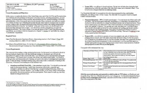
Which would you rather read? 6-8 pages of dense black-and-white text?
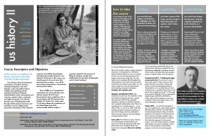
Or the same information, reformatted into a magazine layout?
Is this change purely cosmetic? Actually, no. Giving a syllabus a profound inside-out reorganization is more than just window dressing. It involves deep thought about your course content and how a student encounters it. Marshall McLuhan said, “the medium is the message” and while the traditional medium for a syllabus is a portrait-oriented 8.5×11 text document printed on paper and handed out the first day of class… it needn’t be the only possibility.
I’ve written elsewhere about my experiences with this process, starting with giving the syllabus for my standard US History II course an “Extreme Makeover” for the Spring 2011 term. I called it “extreme” because not only did I adopt some graphic design principles, I also framed the class to give students more responsibility for the learning, including punching some holes in the semester to be filled with student-chosen content later. It was a course redesign on many levels, and the eye-catching syllabus that resulted was the culmination of a deeper rethinking of what I was teaching and what I wanted my students to learn.
As I have reconsidered both the form and function of a college course syllabus, I’ve continued to play with different looks using stock templates in Pages for Mac. My aim is to reduce textual clutter, jargon, and bloat and instead give pared-down, readable, technologically savvy syllabi that suggest—at a glance—my personality and the approach of the course. My Spring 2012 undergraduate courses might serve to illustrate this, displayed as e-magazines using (free) Flipsnack PDF to Flash converter:
- US History II is no-nonsense with images from the Library of Congress (Pages template: Design)
- US Since 1945 is more playful and colorful with a pop-culture edge (Pages template: Modern)
- and Citizen Nation hints at the complex accretion of meanings for American citizenship with a scrapbook-like, vintage layout (Pages template: Collector)
Although prohibitively expensive to print this way, it costs nothing to share a lovely full-color PDF suitable for my students’ screens and tablets. A plain-text “traditional” syllabus can still be handed out in class, but if my students are already accessing most of their course materials online, it makes sense for a version of the syllabus to be well adapted to digital environments. At the least, it acknowledges the reality that a syllabus is a dynamic living document. Of course, a syllabus can be reconsidered as something other than a document (e.g. an infographic or chart, a series of nested digital folders, a Google calendar or Google doc).
Good resources:
- The University of Minnesota’s fabulous and comprehensive Syllabus Development web tutorial
- World Lecture Hall, offering free online course materials including a wide range of syllabi
- A million-syllabi downloadable database: brainchild of Dan Cohen’s Syllabus Finder, from the Center for History and New Media at George Mason University
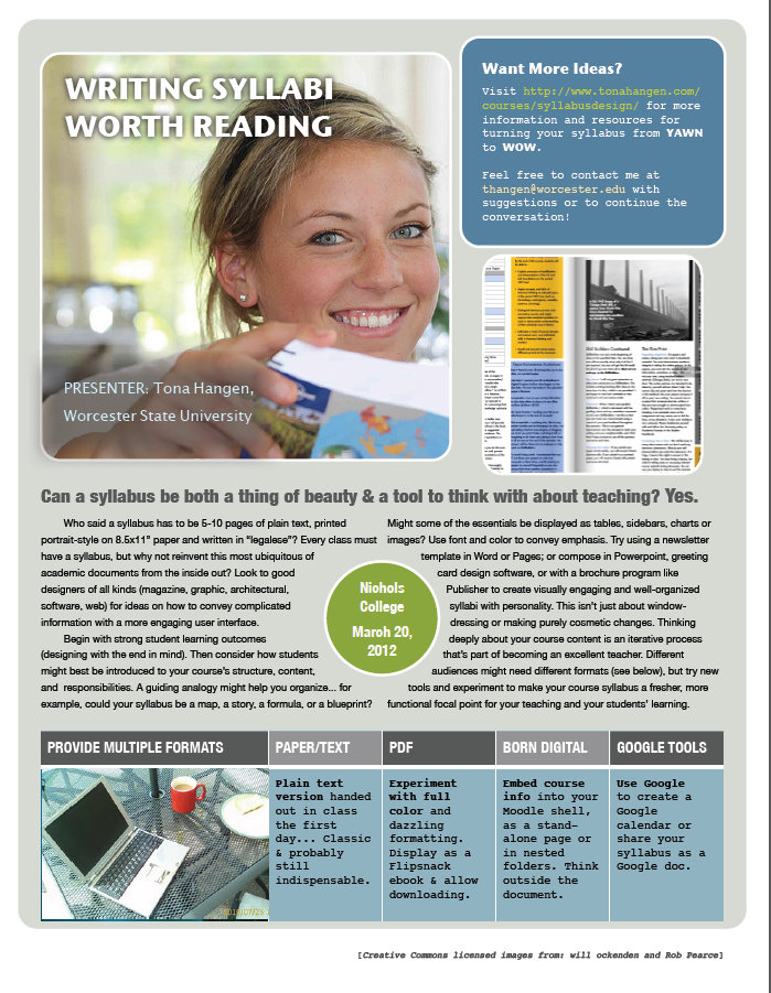
Others have found my suggestions helpful or inspiring; my original syllabus redesign was used in a popular August 2011 ProfHacker post by Jason B. Jones, “Creative Approaches to the Syllabus,” and I’ve also posted about course design in a series for the religious history blog The Juvenile Instructor. I have presented my approach to syllabus design at the Fall 2011 New England Faculty Development Consortium (NEFDC) conference, “Designing and Documenting for Student Success,” and at Nichols College in Spring 2012 (click on the image below for that session’s handout).


Pingback: Writing Syllabi Worth Reading « Tona Hangen | Teaching Music Online
Pingback: Redesigning Your Syllabus – Educational Technology & Design in the School of Nursing